Project # 5: Calling Card
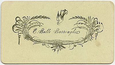
I’ve been into the idea of making a calling card for a long time. I like the idea of a simple card with just a name and a way to get in touch with someone. Not a business card, mind you, although they have their place (when I was looking at card ideas online, I came across this post with all these fab designs for business cards, some more successful than others). In the old-timey days, calling cards could be as simple as this:

Right now I am looking for a job and have no “business card” to hand out. That’s why I’m happy to have my new calling card. The last time I did have a business card to hand out, I hated that card. It didn’t say anything about me. Even the title, thought up by my boss, was embarrassing to me. The interesting thing about that card was that it became completely useless as soon as I didn’t have the job anymore – there was no “me” in that card at all. It belonged to the business.
A “calling card” or personal card doesn’t put a business or a title first, which seems counter-intuitive to the way we live now. But according to the branding and social media gurus, we should meld our business with our play, our social media accounts with our work personna – every representation of ourselves should be another piece that contribute to a concise, branded whole. What you put forward first does matter – is it the company you work for or YOU?
Calling cards are perfect for introducing yourself in a more personal way. {You can read about the history of the calling card here.]
If you’re like me (when employed) you don’t want to be in work mode all the time or worrying about your “personal brand.” Many times I’ve thought that my personal brand should just be “Messy.” I don’t want to feel that others are always evaluating what I do in my private life in terms of my “brand,” and I try not to do this to other people. What I mean is, sometimes you just want to hand people a card that has your name and contact info on it and a little hint of what you’re about.
Also, if someone hands you a business card, you can’t help but make a judgement about them based on their job. We’re only human! You now know what they do for money and, yes, it’s probably a big part of who they are but let’s hope it’s not the entire picture. On the other hand, if someone hands me a calling card or personal card, there seems to be more to discover and find out. A calling card says, “Hello, this is me. Want to know more?” while a business card, depending on your profession, can instantly put you into a box people aren’t that excited to open.
Maybe the solution is to have two cards one can hand out according to one’s discretion. What do I want this person to know about me? How do I want to be perceived by them?
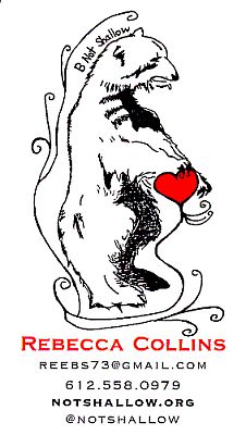
Anyway, this is a long way of explaining that I finally made my own calling card to hand out to people I find interesting and want to get to know. Here it is, literally larger-than-life, in digital form:

I’m not a graphic designer by any means but I knew that I wanted it to have a drawing on it to give it that old-timey feel and I wanted it to have minimal text – just options for ways to get in touch with me and/or find out more about me (this blog and my Twitter account.)
If you’re interested, here is what I did to make it:
- First, I used an antique playing card with a drawing of a bear on it as inspiration and drew a bear of my own, using that one as a model but adding the heart and loops. I did this in pencil and then I went over it in ink. This was important to me in order for the drawing to have a sketchy look.
- Next, I scanned the drawing and brought it into Illustrator to make it into a vector using the live trace feature.
- I used live paint to make the heart red. I could have added more color but I didn’t want to take away from the simplicity of the drawing. Keep it simple.
- I re-sized the bear to fit onto a standard card and then set up my card in InDesign, putting several copies of it “up” on a page.
- I had them printed at a print shop because I didn’t want to mess around with home printing and cutting, which would have made them look a bit too homemade. Even when using a paper cutter, I manage to cut things crooked. I had them printed on extra thick card stock – thicker than the usual business card stock – and went with a matte finish instead of shiny.
It was my hope to have them printed on a letterpress but it’s not in the cards (ha ha ha – see how I did that) right now due to the expense. I did spend a lot of time looking at the sites for Studio On Fire and Lunalux, two shops in Minneapolis, and am amazed at how awesome their work is. In fact, check out these calling cards from the Lunalux site – they are simple and chic and show that fancy graphics or drawings are not at all necessary.
I definitely aspire to letterpress cards on a heavy linen-like stock. But a gal’s gotta start where she can… and dream.

Maybe by the time I hand out all 500 of these cards, I’ll be in a position to upgrade!
